Hello!
About
My name is Colton Flick. I'm a writer, graphic designer, game designer, and project manager whose work has been featured in publications like Vox and A.V. Club. You can check out some of my work below. Feel free to get in touch if you'd like more information about anything here, or if you'd like to work together!
Major Projects
(motion graphics, script, research)
A series of video essays dissecting the mechanics and design of tabletop role-playing games. Heavily focused on motion graphics with a mixed-media aesthetic. My Capstone project for my M.A. in Interactive Media.
(project manager)
A website and branding revamp for a Bermudian charity focused on heart health and preventative care. My team flew to Bermuda to work with our client and shoot interviews before returning to Elon, NC to finish the project.
(writer & audio editor)
A fiction podcast. The last five people on earth hear a knock at the door. More than 75,000 downloads. Reached number 14 on the Apple Podcast fiction charts.
The Magical History of Knox County
(head writer & audio editor)
A fiction podcast about magic & mystery in rural Ohio. Official Selection at DC Web Fest. Featured in Vox and Podcast Problems.
(game & graphic design)
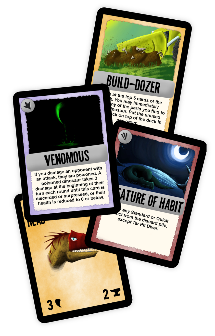
A zany tabletop game about about mix-and-match dinosaurs. Funded via Kickstarter. Featured at Playthrough 2016.
Still Lives

"It's both a poem and a mystery, and I love this show a whole lot."
-- Jack Pevyhouse, writer and producer for Crossroad Stations
The last five people on earth hear a knock at the door.
Still Lives is a short fiction podcast. We called it "pastoral post-apocalyptic." It's about the survivors of a major, apocalyptic event, but its mostly focused on the ways they connect to each other, the secrets they keep,and the way they process their trauma.
From the start, we wanted this show to be a different kind of post-apocalypse. Something small, intimate, and nuanced. Listeners and reviewers really responded to that. This show feels more like a stage play than a sci-fi thriller.
I was one of four writers and two audio editors on this show. Our writing staff worked as a small & cohesive creative unit to develop the world of the show, plot the arc of the season, flesh out our characters, and cast and direct our actors.
In addition to my work on the show itself, I worked to publicize the show, negotiated contracts with our sponsor, designed our website, and assisted in running our social media.
Still Lives has been featured in AV Club, nominated for multiple Audioverse Awards, and has been downloaded more than 80,000 times. It peaked at number 13 on the Apple Podcasts Fiction charts.
The Magical History of Knox County

"I’m so grateful for shows like The Magical History of Knox County to break the genre mold and truly embrace doing something different."
-- Wil Williams, writer and reviewer for Podcast Problems, Podmass, and DiscoverPods
The Magical History of Knox County is a short fiction podcast about a magical community hidden in rural Ohio. It was recorded in the WKCO studio, in the actual Knox County, Ohio, and released on World Audio Drama Day in 2017. It's been downloaded more than 25,000 times, and has numerous five-star ratings on iTunes, Podchaser, and other podcast platforms.
I was one of the head writers for this show, so I helped develop the overall story arc, aesthetic, and world of the show. I also wrote the first and final episode and co-wrote or assisted with many others.
I also worked as our lead audio editor. Of our nine episodes, I either edited or co-edited seven of them.
In addition to writing, I worked as an audio editor, voice actor, graphic designer, script editor, and social media manager, among other small jobs.
I'm particularly proud of the response to this show -- so many of our reviews specifically mentioned the heart and optimism of the show as a whole, despite its dark moments. That's exactly what we hoped would come through in this series.
This show was a particular sound design and audio editing challenge. Our characters routinely encounter (or in some cases, are) strange magical creatures, many of which were invented for our show.
The Magical History of Knox County was an Official Selection at DC Web Fest and was featured on Vox and Podcast Problems.
Album Art
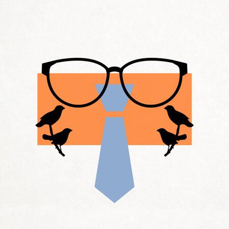
I wanted the album art for the show to be evocative of the show’s tone without giving much away. The birds are a major mid-season plot point. It was important to me to show the protagonist surrounded by them, but in a way that felt inconsequential until the mid-season reveal.
Similarly, I wanted to depict the protagonist without tying him down to a particular physical appearance. We considered it a unique advantage of the medium that our characters could look however the audience imagined them, and we didn’t want official art to contradict the impressions listeners got from the audio itself.
The show has a heavy focus on old-school and analogue mediums, so I also chose to depict the art on a paper background, to add texture and physicality.
At the time, we weren’t sure if we would produce additional seasons of the show. I liked this design in particular because it allowed for new symbols to replace the birds in each successive season.
Print Ads
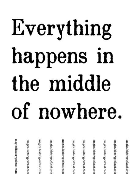
Physical ads for the show were a major part of our publicity strategy, and proved more effective than any other ad type.
Because audio drama is a relatively niche medium, we went in with the assumption that “full-cast narrative audio drama” meant nothing to most people who would see the ad, and we should instead focus on getting people engaged with the inherent mystery of the show. Our physical ads were bold and simple as a result.
Audio drama can be a very personal medium, as it’s frequently listened to on headphones alone. We wanted to use our ads to enhance the feeling of discovery. We placed the ads in intentionally strange or out-of-the-way places, so seeing one was more memorable than seeing a normal ad.
Online Presence
Like all of our branding, our website was meant to feel simple, evocative, and retro. Our website, like most of our promotional materials, doesn’t make it clear up-front that the show isn’t an actual radio show airing in rural Ohio.
Our digital ads and promotional materials on Twitter, Tumblr, and Facebook were designed to promote listener engagement. We based our ads on moments and characters from the show, and built them around the ways fan communities typically interact with shows in our medium.
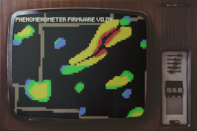
We tailored ads and promotions to the specific place where they ran -- some were focused on mystery, others on comedy, and others on character -- and targeted existing hubs for fandom.
Our website also needed to be simple and effective for listeners who had never listened to a podcast, since our advertising targeted that group.
Terrible Lizards
"My kids and I play this game. They love it and it's easy for me to enjoy playing with them! Always different, always fun!"
-- BoardGameGeek user Chwboa
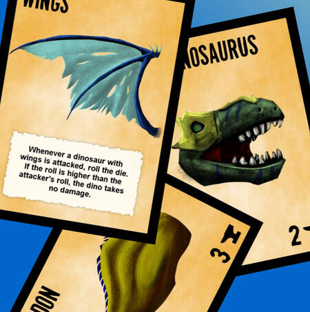
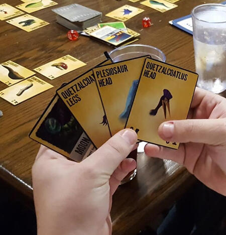
Terrible Lizards is a tabletop card game. Players mix and match pieces of dinosaurs -- like a velociraptor legs, a stegosaurus body, and an iguanodon head -- to make a horrible hodge-podge dinosaur to attack their opponents.
We designed Terrible Lizards to scratch the itch of deckbuilding card games like Magic: the Gathering or Android: Netrunner without the complexity, continued investment, or time commitment. You can pick up a copy of Terrible Lizards and be playing in a few minutes.
As a result, Terrible Lizards is a great game for kids or casual players. It's easy to learn, requires no preparation, and a game runs quickly. A key design goal was making sure that every turn felt like it had the potential to completely change the game.
The game has a number of unique features. Terrible Lizards is defined by its puzzle piece mechanic, where players physically arrange cards on the table in front of them to create an image of their dinosaur. Unlike most of our influences, Terrible Lizards uses a single deck from which all players draw, and a single, communal discard pile. Players draw cards frequently, and will almost always have a full hand. We wanted players to feel like they always had numerous meaningful and interesting options.
From a graphic design standpoint, we wanted the look of the game to appeal to children, and to reflect the wild, chaotic feel of play while still being clearly readable and easy to understand.
Terrible Lizards was funded via Kickstarter. I designed the Kickstarter graphics and co-wrote the Kickstarter copy.
While we work on developing and funding a second edition, the first edition is available for free via Tabletop Simulator.
Bermuda Heart Foundation
As part of my MA in Interactive Media, I served as Project Manager for a group of students who reworked the website, communications, and branding of the Bermuda Heart Foundation, a charity focused on heart health and preventative care in Bermuda.
Just over sixty thousand people live in Bermuda, and the island is hundreds of miles from the nearest landmass. Because Bermuda is so small and so remote, it's difficult to economically sustain a state-of-the-art hospital. For many procedures, patients need to book flights to New York or Boston and receive care in the United States, which can be costly and slow.
The Bermuda Heart Foundation has both raised money to support Bermuda's existing healthcare infrastructure and developed programs to help Bermudians lead active, healthy lifestyles in an effort to reduce the need for emergency medicine.
While the work the Foundation was doing was incredibly important and effective, it was also complex, and at times difficult to communicate to potential donors. The Foundation oversaw a large number of programs as well as sub- and sister organizations like Jump 2B Fit and CORE Heart Health Center.
My team worked to help communicate the organizations' goals more clearly and effectively by reworking their website, logos, promotional materials, and branding. We compiled several videos showcasing interviews with Bermuda Heart Foundation employees and people who had been helped by the Foundation's services, as well as long term plans for marketing and promoting the organization itself.
Plus Sharp
Plus Sharp is a series of video essays, primarily using motion graphics, dissecting the mechanics and design of tabletop role-playing games. Each video analyzes primary sources and later commentary to walk viewers through the design choices underlying successful and effective games, while illustrating and reinforcing the points made via fluid motion graphics.
This project was my Capstone for the Elon University Interactive Media program.
